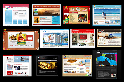
How many times have you visited a website, only to turn right around because the design was so garish you could hardly spend a moment on it? Designing your site so that it is appealing to the visitor will help you translate more visits into actual sales.
These tips will help you create a site that is appealing and, therefore, successful.
1. Invest in Quality Content:
– Graphics are important, but content is probably more so. The right use of text written in a web-friendly manner is one of the first things your visitors notice.
Keep your text clear, concise and prominent on the page, and do not allow graphics and other “special effects” to drown out your textual message.
Also, make sure that the font is legible. Stick to something easy to read, like Ariel, and keep the size between 10 and 14 points.
2. Empower readers to share content:
– Social media is one of your more valuable marketing tools, and the “buttons” you can place on your site make it easy for visitors to share.
You do want to utilize these buttons, because the easier it is for your visitors to share your content, the more effective that content will be.
Be cautious, though.
Too many of these can make your site look like a button factory rather than a trusted resource. They can glaringly detract from your overall design, particularly if it is fairly formal in appearance.
Add sharing buttons, but do it in a classy, subdued way.
If someone finds your content valuable enough to want to share it, they will search for that sharing button.
3. De-clutter Your Sidebar
– As you are looking at making the site look less cluttered, you may feel tempted to add elements and links that do not fit on the page to your sidebar.
This is fine, but make sure you are not making that sidebar too cluttered. Clutter will drive people away quickly.
When you make the decision to add something to your sidebar, only do so if you are certain the item adds value to your site. If it does not, do not add it. You can always have a “resources” page elsewhere for these types of links.
4. Make Home Page link Prominent
– If a user wants to visit your home page, they do not want to go anywhere else. Make sure that you add a “home” button that will quickly and easily take them there.
The “home” button needs to be clear on each and every page of your site, preferably near the top right of the page where the reader expects it to be.
Sometimes you can have your company’s logo serve as the link to the home page. Most users expect this, so it is a fine page element, but if you want your site to be very user friendly, install an actual “home” button.
This will ensure that everyone, no matter how web illiterate they are, can find the home page when they need it.
5. Make Scrolling User Friendly
– When was the last time you were on a site that required you to scroll left-to-right? When you were, did you automatically adjust the text to prevent this problem?
People do not scroll left-to-right, and requiring them to do so will simply push them away. Scrolling should always be vertical. Keep in mind that most readers will not scroll at all, so your most important information needs to be above the fold, readily available without the need to scroll.
Remember, a site that people enjoy visiting is a site that will help you reach your business goals. A site with design elements that drives people away will fail. Focusing on proper site design will create a powerful web presence for your business.
6. Get Scheming
Do you know what complementary colors are? Tertiary? If you don’t, you’re going to need more than someone with a good eye. Themes control one aspect of your site’s visuals, but your color scheme is nearly equal in importance.
Doing a little research into what colors go well together and how different hues convey varied messages will spare your visitors the eyesore of a clashing color scheme. Then stop by ColorSchemeDesigner to put that research to the test.
7. Avoid Spamigation
– You’re site needs to be easy to navigate, but having too many options is just as bad as too few. Inundate your visitors with too many buttons and paths back to the home screen and you’ll diminish the purpose of your site.
Guide visitors with a few, easy-to-spot tools to get around and leave out excess markers. Use a heatmap to figure out where people are clicking on your page, and then place your buttons accordingly.
Image Credit:Balbuena

2 comments
Yeah, it is very important that your website would be easier to get a hang of using and easier to understand. There are a lot of other websites that have a lot of things on the home site that makes thing complicated. If you really want your website or blog to have more returning visitors then you should give them a reason to return.
Alyse, that’s a good idea to use heatmap to figure out where most people will click. Then, we can place our call-to-action in those spots! I am sure this will increase click through rate tremendously!
Comments are closed.